CASE STUDY · IBM HMC
COMPANY
IBM
ROLE
UX Designer
TIMEFRAME
2020–2021
TOOLS
Sketch · InVision
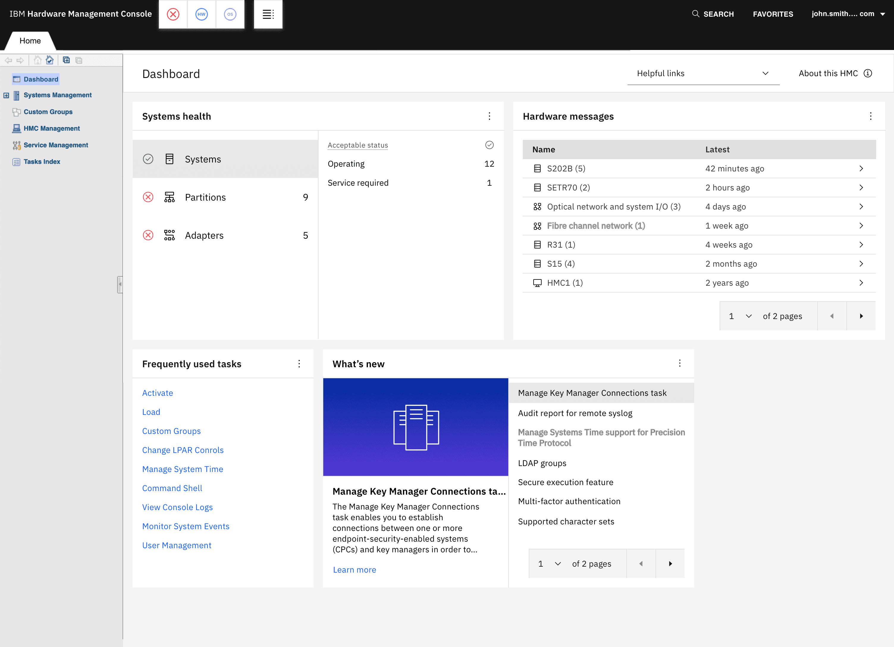
The final four-widget HMC Dashboard.
Project overview
The IBM Hardware Management Console (HMC) is used to monitor and manage IBM Z and LinuxONE systems. Over the years, HMC had grown into a large enterprise product supporting many different users, responsibilities, and workflows.
Research from our team showed that people often came to HMC with a specific task already in mind. Operators, system programmers, administrators, and other users each relied on different parts of the product depending on their responsibilities. At the same time, valuable functionality could be difficult to discover across such a broad platform.
Rather than trying to redesign HMC all at once, we saw an opportunity to rethink its landing experience. The Dashboard could give users immediate access to important system information, hardware messages, commonly used tasks, and new functionality, with room for the experience to grow over time.
My role
I was a UX Designer on the HMC team, working with Design Lead Christopher DeCicco, UX Researcher Denver Nash, UX Designer Scott Marcella, and Visual/UX Designer Lexi Landis.
My involvement began with the early Dashboard direction. I created the initial concepts in Procreate, exploring different layouts, widgets, customization, and role-based experiences. I then developed those ideas into mid-fidelity Dashboard designs as the team narrowed the concept toward an initial release.
As responsibilities became distributed across the team, I owned the Hardware Messages experience and the concept and interaction design for What’s New. I also contributed early exploration to Systems Health before Lexi took ownership of that area. Later, I brought the team’s work together into a master Sketch file and built an end-to-end InVision prototype for user testing. I also created detailed UX specifications for Hardware Messages and the Workspace Tour.
Rethinking the HMC landing experience.
One of the things that stood out from our research was that there wasn’t really a single “typical” HMC user.
Operators, system programmers, administrators, testers, and other users came to HMC with different responsibilities and different reasons for being there. Often, they already had a specific mission in mind when they logged in.
At the same time, HMC had accumulated a large amount of functionality over the years. That made it a powerful tool, but it also meant useful capabilities weren’t always obvious unless someone already knew where to find them.
The existing landing experience wasn’t doing much to help with that. It provided basic system information and links, but there was an opportunity to make that space much more useful.
Instead of trying to overhaul such a large product at once, we focused on a smaller question:
How could we surface valuable information and tasks as soon as someone entered HMC?
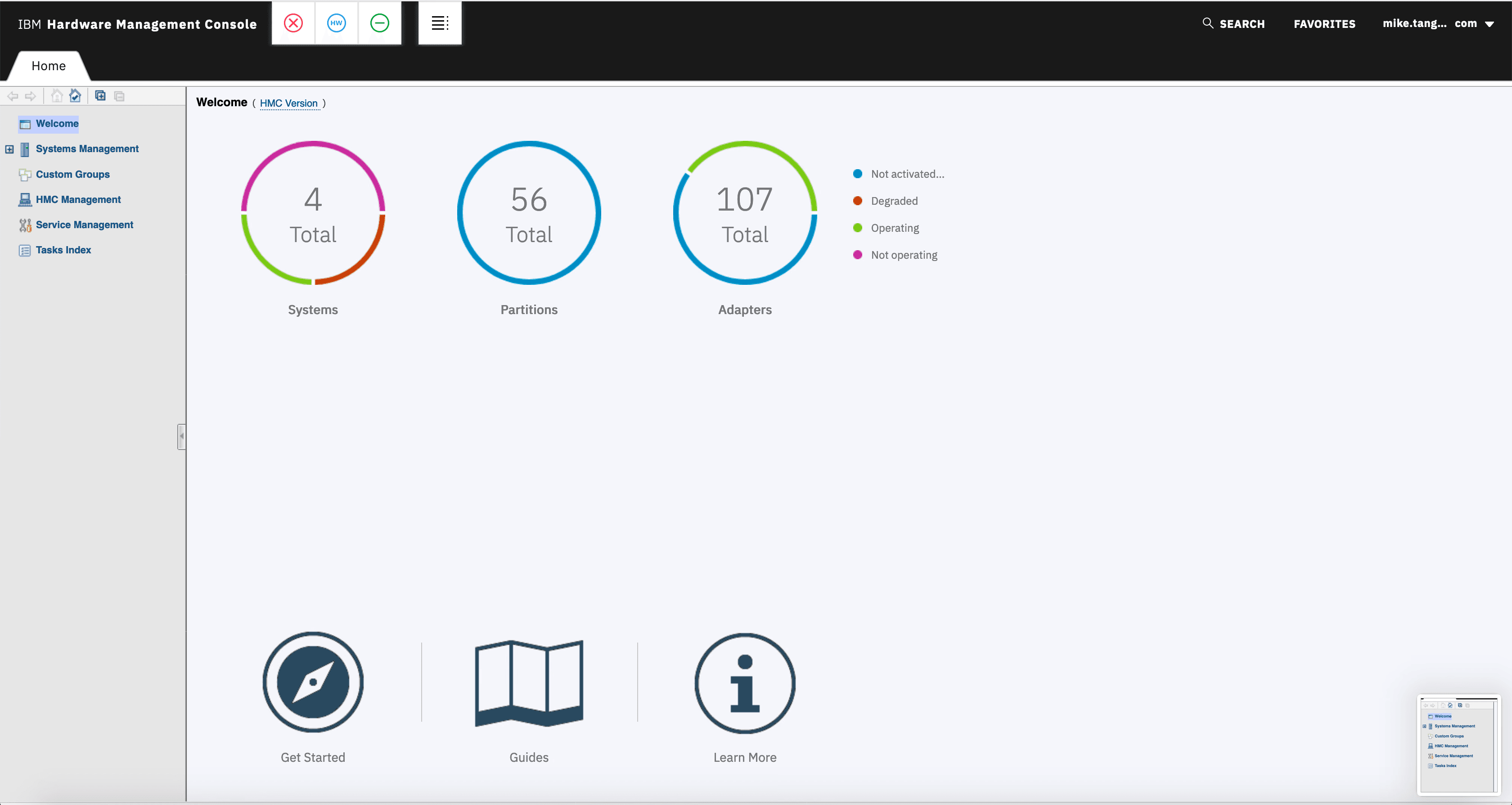
The earlier Welcome page provided basic system information and learning links, but offered little guidance toward the tasks users came to HMC to complete.
Exploring a more useful starting point
I started by sketching broad Dashboard concepts in Procreate.
At this stage, I wasn’t trying to define the final interface. I wanted to explore what the Dashboard could become if we treated it as more than a static landing page.
I experimented with modular widgets for system health, recent activity, product updates, notes, and frequently used tasks. I also explored customization and role-based dashboards, where an Operator could see a different combination of information than someone working in another role.
The broader idea was that the Dashboard could eventually become a flexible workspace, with information tailored to different responsibilities and room for new widgets as HMC evolved.
During a design critique, each designer shared concepts for the Dashboard. The team responded well to my Procreate concepts, and we decided to keep developing that direction. We also considered a broader set of improvements across the Dashboard, content, navigation, and platform, weighing each against user impact and what engineering could realistically support. That process helped narrow the initial Dashboard down to four areas: Systems Health, Hardware Messages, Frequently Used Tasks, and What’s New.
Early Procreate sketches explored modular content, Dashboard customization, and role-specific views.
Designing the Dashboard as a team
As the direction became clearer, ownership of the individual experiences was distributed across the design team.
Scott focused on Frequently Used Tasks. Lexi took ownership of Systems Health after some of my initial exploration. I focused primarily on Hardware Messages and the interaction design for What’s New, collaborating with Lexi on the latter as she developed its imagery and visual treatment.
This let each of us go deeper into individual problems while continuing to design them as parts of the same Dashboard.
Even with different designers owning each area, the Dashboard still needed to feel like one connected experience.

Hardware Messages — my interaction design.

What’s New — my concept and interaction design; Lexi’s imagery and visual treatment.
Making Hardware Messages work in a constrained space
Hardware Messages was one of the areas I owned throughout the project.
The existing experience could contain detailed system messages and actions, but bringing that functionality into the Dashboard created a different problem:
How much of that experience should actually fit inside a widget?
Trying to recreate the full Hardware Messages application inside a small card would have made the Dashboard harder to use. Instead, I designed the widget around progressive disclosure.
Users could begin with a high-level list of hardware objects and see where messages existed. Selecting an object revealed its individual messages, and selecting a message exposed the full message content along with the actions that made sense within the Dashboard.
For more involved workflows, such as requesting service, the widget provided a path into the existing Hardware Messages experience rather than trying to duplicate that functionality inside the Dashboard.
That kept the widget focused without cutting users off from the deeper tools they might still need.
I explored four approaches to balancing message visibility with the limited space available in the Dashboard. Each iteration tested a different tradeoff between density, readability, and widget height before I converged on a preview-to-message model.
Concept 1: Full messages in the widget
Displaying the full message provided immediate content, but message length made the widget height and density difficult to manage.
Select a hardware object to see its messages.
Choosing a direction
After reviewing these approaches through design critiques with the team, we converged on the preview-to-message model explored in Concept 4. It provided the best balance between keeping several messages visible in the constrained Dashboard widget and giving users enough space to read and act on an individual message.

The chosen direction began with hardware objects and recency.

Selecting an object opened its message previews.
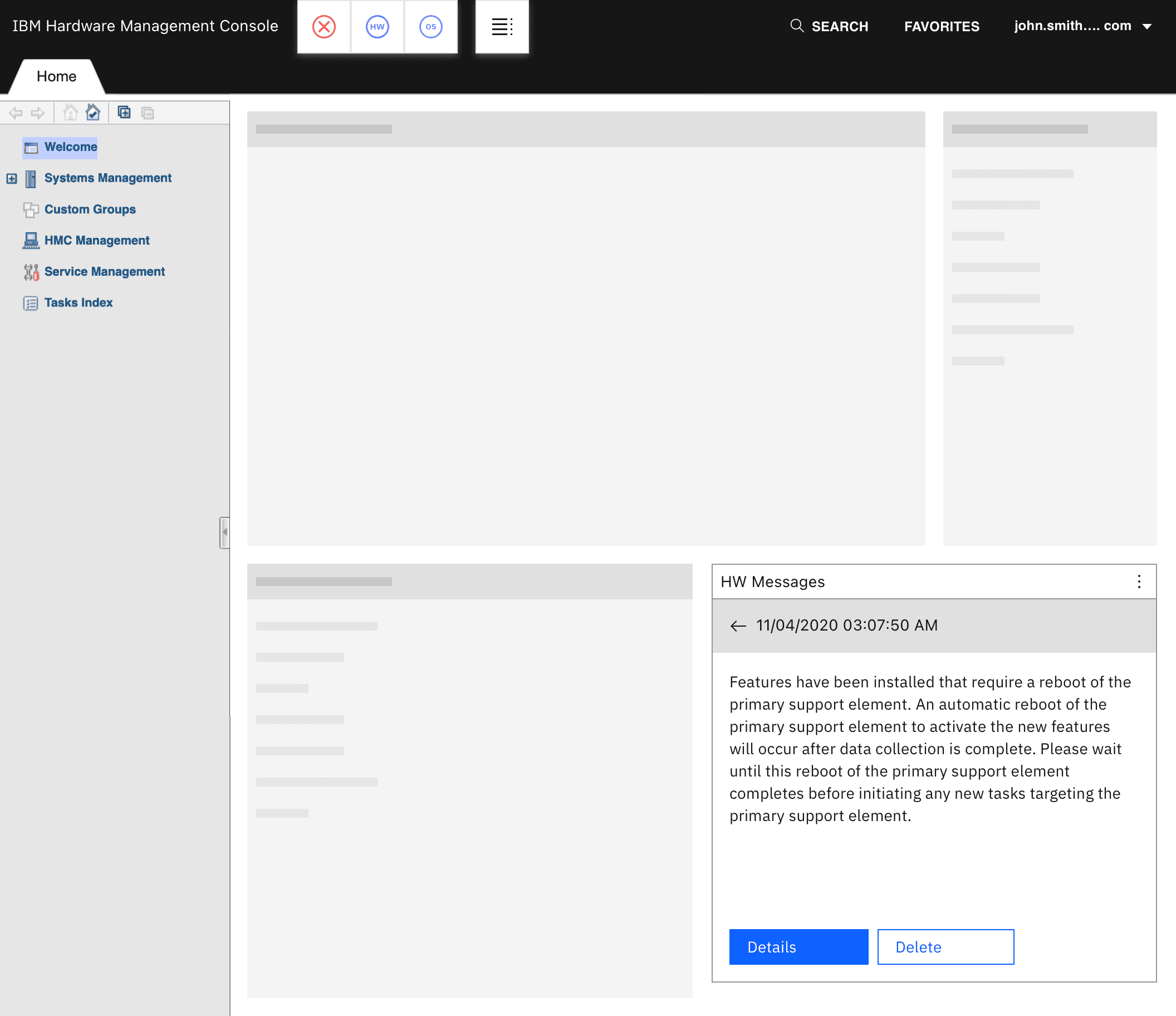
A separate detail state placed the full message and actions inside the Dashboard.
Final Hardware Messages interaction
I carried that model into the final interaction and worked through the details: what information appeared at each level, which actions were available, and when users needed to leave the Dashboard for the full Hardware Messages experience.
Actions also adapted to context. Details remained visible but was disabled when a message did not contain additional information, and enabled when more information was available.
For more involved workflows, the widget linked into the existing Hardware Messages task.

Start with hardware objects, message counts and recency.

Select an object to browse its messages.
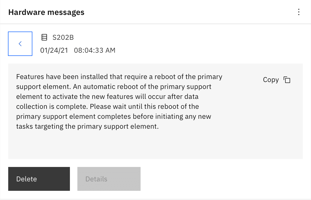
Details remains visible but disabled when additional information is unavailable.

Details becomes enabled when additional information is available.
Handling errors and edge cases
The basic Hardware Messages flow was only part of the problem.
As the interaction matured, I also worked through pagination, permissions, empty states, destructive actions, success and failure feedback, and other edge cases that could occur while users were managing messages.
For example, when deleting a message, the interface removed it immediately while the request was processed. If the request succeeded, the user received confirmation. If it failed, the message was restored and an error notification explained what happened.
Actions also adapted to context. Delete was disabled for read-only users, while Details was disabled when a message didn’t contain additional information.
I documented these behaviors in detailed UX specifications as the designs moved toward implementation.
Working through these states was especially important in HMC because the interface represented real infrastructure. The Dashboard needed to stay compact without hiding information users needed to understand what was happening.
Access restrictions explain why messages cannot be viewed.
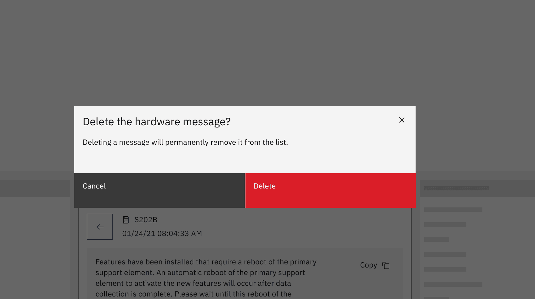
Confirmation precedes a destructive action.

If deletion fails, feedback explains that message has been restored
Making new functionality easier to discover
Another challenge our research identified was that adding functionality to HMC didn’t necessarily mean users would know it existed. With such a broad product, new capabilities could be easy to miss.
That made the Dashboard useful for more than system status and shortcuts. It could also give new features a place where users would actually see them.
I explored this idea early in my Procreate concepts through What’s New content, including product updates, educational material, and even video.
As the Dashboard became more focused, that idea evolved into a dedicated What’s New widget.
Users could browse recently introduced functionality directly from the Dashboard, read a short explanation of a feature, and select Learn more when they wanted the complete HMC documentation.
I designed the concept and interaction model for What’s New while Lexi developed its supporting imagery and visual treatment.
Instead of relying on users to stumble across a new capability somewhere deeper in HMC, What’s New gave those changes a visible place in the product.
The final widget paired feature discovery with a short explanation and Learn more.

Bringing the experience together for testing
As individual parts of the Dashboard matured, I brought the team’s work together into a single master Sketch file and built an end-to-end prototype in InVision.
Different designers owned different parts of the Dashboard, but the prototype needed to behave like one connected experience rather than a collection of individual widgets and screens.
I linked those flows together so we could move through the Dashboard as a complete product and use it during sponsor-user testing with internal and external participants.
Introducing the new experience
The Dashboard represented a significant change for people who were already familiar with HMC. It would replace the existing Welcome page, so we needed a way to introduce the new experience without expecting users to figure everything out on their own.
I designed the Workspace Tour to orient users to the Dashboard and explain its major areas.
The tour appeared when users first encountered the new Dashboard after an update, but it could be skipped rather than blocking their work. If someone wanted to revisit it later, they could launch it again through Helpful Links.
The goal wasn’t to teach every feature up front. It was to give existing users enough context to understand what had changed and then let them get back to what they came to HMC to do.
Like Hardware Messages, I documented the Workspace Tour through a detailed UX specification as the experience moved toward implementation.
The Workspace Tour invited users to explore the new experience or skip it.
Bringing the Dashboard to life
The final Dashboard brought Systems Health, Hardware Messages, Frequently Used Tasks, and What’s New together as HMC’s new landing experience.
The original vision was broader, but focusing the first release around these four areas turned an ambitious concept into something useful and achievable within the product.
The final Dashboard replaced the existing Welcome page with a more useful starting point for HMC.
What I took away
HMC changed the way I thought about designing enterprise software. With a product that large, it was easy to assume that making it better meant redesigning everything. This project taught me that sometimes a focused change in the right place can be more useful than trying to overhaul the entire experience.
It also pushed me to think beyond individual screens. Different users brought different responsibilities into the same product. Widgets had to work within tight constraints. Features designed by different people still needed to behave like one experience. And sometimes the right answer wasn’t bringing an entire workflow into a new interface—it was deciding what belonged there and creating a clear path to the deeper experience when someone needed it.
Looking back, I’m proud that my involvement stretched from the earliest Dashboard sketches through interaction design, prototyping, testing, specifications, and implementation support.
What started as an exploration of a better landing page became a new way for users to begin working in HMC.